matplotlib is a Python-based plotting library with full support for 2D and limited support for 3D graphics, widely used in the Python scientific computing community. The library targets a broad range of use cases. It can embed graphics in the user interface toolkit of your choice, and currently supports interactive graphics on all major desktop operating systems using the GTK+, Qt, Tk, FLTK, wxWidgets and Cocoa toolkits. It can be called interactively from the interactive Python shell to produce graphics with simple, procedural commands, much like Mathematica, IDL or MATLAB. matplotlib can also be embedded in a headless webserver to provide hardcopy in both raster-based formats like Portable Network Graphics (PNG) and vector formats like PostScript, Portable Document Format (PDF) and Scalable Vector Graphics (SVG) that look great on paper.
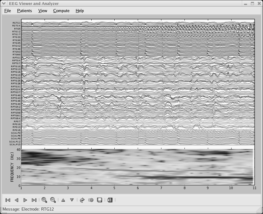
matplotlib's origin dates to an attempt by one of us (John Hunter) to free himself and his fellow epilepsy researchers from a proprietary software package for doing electrocorticography (ECoG) analysis. The laboratory in which he worked had only one license for the software, and the various graduate students, medical students, postdocs, interns, and investigators took turns sharing the hardware key dongle. MATLAB is widely used in the biomedical community for data analysis and visualization, so Hunter set out, with some success, to replace the proprietary software with a MATLAB-based version that could be utilized and extended by multiple investigators. MATLAB, however, naturally views the world as an array of floating point numbers, and the complexities of real-world hospital records for epilepsy surgery patients with multiple data modalities (CT, MRI, ECoG, EEG) warehoused on different servers pushed MATLAB to its limits as a data management system. Unsatisfied with the suitability of MATLAB for this task, Hunter began working on a new Python application built on top of the user interface toolkit GTK+, which was at the time the leading desktop windowing system for Linux.
matplotlib was thus originally developed as an EEG/ECoG visualization tool for this GTK+ application, and this use case directed its original architecture. matplotlib was originally designed to serve a second purpose as well: as a replacement for interactive command-driven graphics generation, something that MATLAB does very well. The MATLAB design makes the simple task of loading a data file and plotting very straightforward, where a full object-oriented API would be too syntactically heavy. So matplotlib also provides a stateful scripting interface for quick and easy generation of graphics similar to MATLAB's. Because matplotlib is a library, users have access to all of the rich built-in Python data structures such as lists, dictionaries, sets and more.
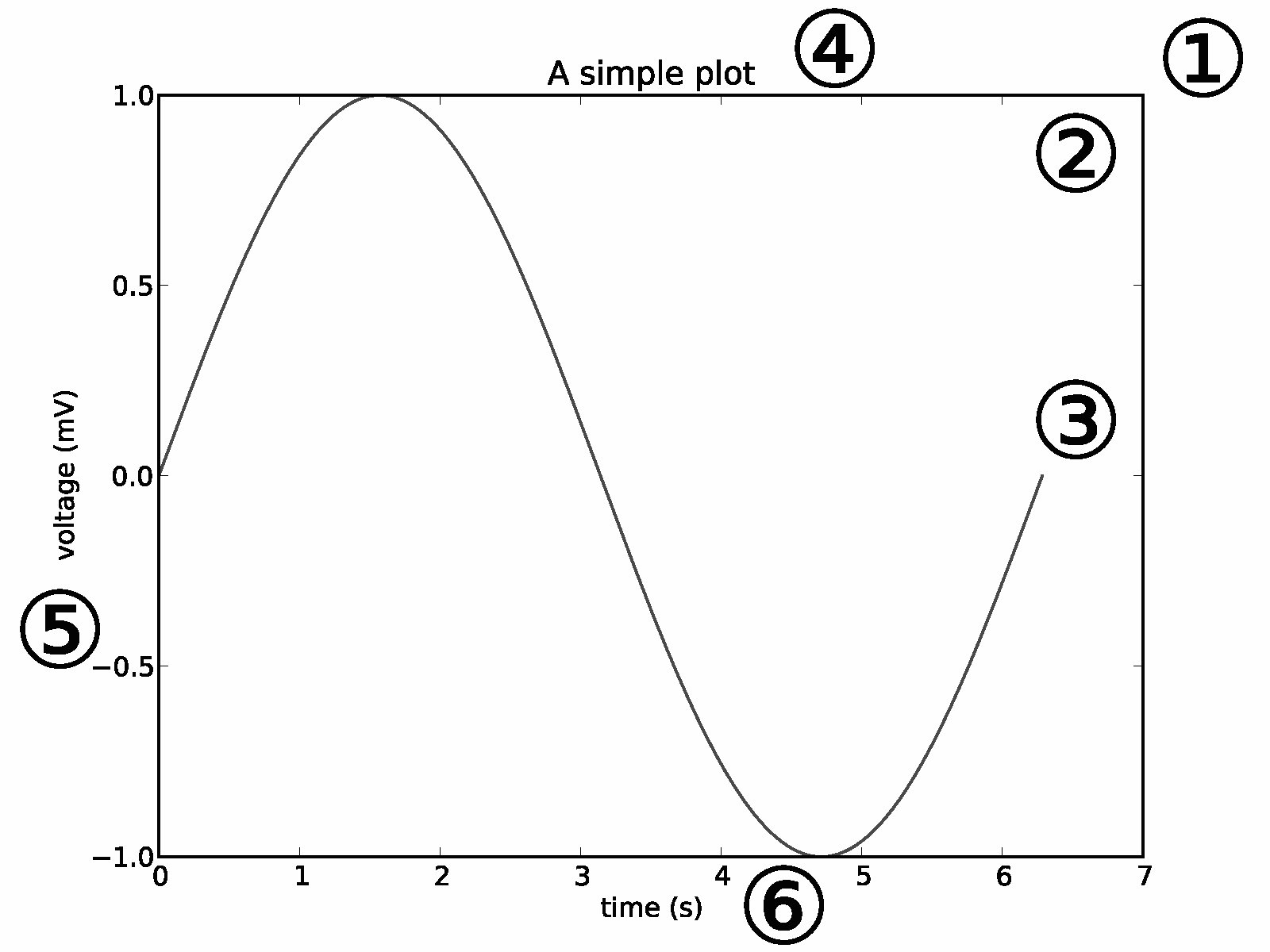
The top-level matplotlib object that contains and manages all of the
elements in a given graphic is called the Figure. One of the
core architectural tasks matplotlib must solve is implementing a
framework for representing and manipulating the Figure that
is segregated from the act of rendering the Figure to a user
interface window or hardcopy. This enables us to build increasingly
sophisticated features and logic into the Figures, while
keeping the "backends", or output devices, relatively simple.
matplotlib encapsulates not just the drawing interfaces to allow
rendering to multiple devices, but also the basic event
handling and windowing of most popular user interface toolkits.
Because of this, users can create fairly rich interactive graphics
and toolkits incorporating mouse and keyboard input that can be
plugged without modification into the six user interface toolkits we support.
The architecture to accomplish this is logically separated into three layers, which can be viewed as a stack. Each layer that sits above another layer knows how to talk to the layer below it, but the lower layer is not aware of the layers above it. The three layers from bottom to top are: backend, artist, and scripting.
At the bottom of the stack is the backend layer, which provides concrete implementations of the abstract interface classes:
FigureCanvas encapsulates the concept of a surface to draw
onto (e.g. "the paper").
Renderer does the drawing (e.g. "the paintbrush").
Event handles user inputs such as keyboard and mouse events.
For a user interface toolkit such as Qt, the FigureCanvas has a
concrete implementation which knows how to insert itself into a native
Qt window (QtGui.QMainWindow), transfer the matplotlib Renderer
commands onto the canvas (QtGui.QPainter), and translate native
Qt events into the matplotlib Event framework, which signals the
callback dispatcher to generate the events so upstream listeners can
handle them. The abstract base classes reside in
matplotlib.backend_bases and all of the derived classes live
in dedicated modules like matplotlib.backends.backend_qt4agg.
For a pure image backend dedicated to producing hardcopy output like
PDF, PNG, SVG, or PS, the FigureCanvas implementation might
simply set up a file-like object into which the default headers,
fonts, and macro functions are defined, as well as the individual
objects (lines, text, rectangles, etc.) that the Renderer creates.
The job of the Renderer is to provide a low-level drawing
interface for putting ink onto the canvas. As mentioned above, the
original matplotlib application was an ECoG viewer in a GTK+
application, and much of the original design was inspired by the
GDK/GTK+ API available at that time. The original Renderer API
was motivated by the GDK Drawable interface, which implements
such primitive methods as draw_point, draw_line,
draw_rectangle, draw_image, draw_polygon, and
draw_glyphs. Each additional backend we implemented—the
earliest were the PostScript backend and the GD backend—implemented
the GDK Drawable API and translated these into native
backend-dependent drawing commands. As we discuss below, this unnecessarily
complicated the implementation of new backends with a large
proliferation of methods, and this API has subsequently been
dramatically simplified, resulting in a simple process for porting
matplotlib to a new user interface toolkit or file specification.
One of the design decisions that has worked quite well for matplotlib is support for a core pixel-based renderer using the C++ template library Anti-Grain Geometry or "agg" [She06]. This is a high-performance library for rendering anti-aliased 2D graphics that produces attractive images. matplotlib provides support for inserting pixel buffers rendered by the agg backend into each user interface toolkit we support, so one can get pixel-exact graphics across UIs and operating systems. Because the PNG output matplotlib produces also uses the agg renderer, the hardcopy is identical to the screen display, so what you see is what you get across UIs, operating systems and PNG output.
The matplotlib Event framework maps underlying UI events like
key-press-event or mouse-motion-event to the
matplotlib classes KeyEvent or MouseEvent.
Users can connect to these events to callback functions and
interact with their figure and data; for example, to pick
a data point or group of points, or manipulate some aspect of the
figure or its constituents. The following code sample illustrates
how to toggle all of the lines in an Axes window when the
user types `t'.
import numpy as np
import matplotlib.pyplot as plt

def on_press(event):
    if event.inaxes is None: return
    for line in event.inaxes.lines:
        if event.key=='t':
            visible = line.get_visible()
            line.set_visible(not visible)
    event.inaxes.figure.canvas.draw()

fig, ax = plt.subplots(1)

fig.canvas.mpl_connect('key_press_event', on_press)

ax.plot(np.random.rand(2, 20))

plt.show()
The abstraction of the underlying UI toolkit's event framework allows both matplotlib developers and end-users to write UI event-handling code in a "write once run everywhere" fashion. For example, the interactive panning and zooming of matplotlib figures that works across all user interface toolkits is implemented in the matplotlib event framework.
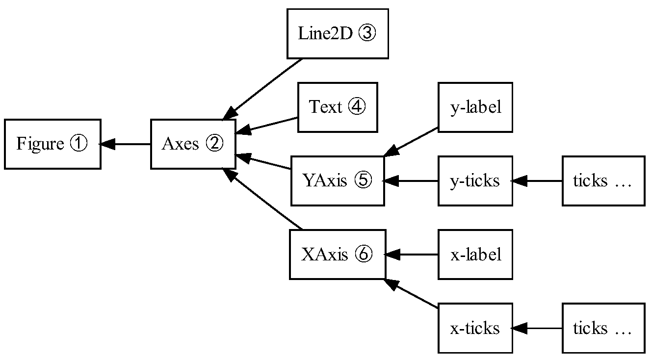
The Artist hierarchy is the middle layer of the matplotlib
stack, and is the place where much of the heavy lifting happens.
Continuing with the analogy that the FigureCanvas from the
backend is the paper, the Artist is the object that knows how
to take the Renderer (the paintbrush) and put ink on the
canvas. Everything you see in a matplotlib Figure is an
Artist instance; the title, the lines, the tick labels, the
images, and so on all correspond to individual Artist instances
(see Figure 11.3). The base class is
matplotlib.artist.Artist, which contains attributes that every
Artist shares: the transformation which translates the artist
coordinate system to the canvas coordinate system (discussed in more
detail below), the visibility, the clip box which defines the region
the artist can paint into, the label, and the interface to handle user
interaction such as "picking"; that is, detecting when a mouse click
happens over the artist.
The coupling between the Artist hierarchy and the backend
happens in the draw method. For example, in the mockup class below
where we create SomeArtist which subclasses Artist, the
essential method that SomeArtist must implement is draw,
which is passed a renderer from the backend.
The Artist doesn't know what kind of backend the renderer is going to
draw onto (PDF, SVG, GTK+ DrawingArea, etc.) but it does know the
Renderer API and will call the appropriate method
(draw_text or draw_path). Since the Renderer has
a pointer to its canvas and knows how to paint onto it, the draw
method transforms the abstract representation of the Artist to
colors in a pixel buffer, paths in an SVG file, or any other
concrete representation.
class SomeArtist(Artist):
    'An example Artist that implements the draw method'

    def draw(self, renderer):
        """Call the appropriate renderer methods to paint self onto canvas"""
        if not self.get_visible():  return

        # create some objects and use renderer to draw self here
        renderer.draw_path(graphics_context, path, transform)
There are two types of Artists in the
hierarchy. Primitive artists represent the kinds of objects you
see in a plot: Line2D, Rectangle, Circle, and
Text. Composite artists are collections of
Artists such as the Axis, Tick, Axes, and
Figure. Each composite artist may contain other composite
artists as well as primitive artists. For example, the Figure contains
one or more composite Axes and the background of the
Figure is a primitive Rectangle.
The most important composite artist is the Axes, which is where most
of the matplotlib API plotting methods are defined. Not only does the
Axes contain most of the graphical elements that make up the
background of the plot—the ticks, the axis lines, the grid, the
patch of color which is the plot background—it contains numerous
helper methods that create primitive artists and add them to the Axes
instance. For example, Table 11.1 shows
a small sampling of Axes methods that create plot objects and store
them in the Axes instance.
| method | creates | stored in |
Axes.imshow | one or more matplotlib.image.AxesImages | Axes.images |
Axes.hist | many matplotlib.patch.Rectangles | Axes.patches |
Axes.plot | one or more matplotlib.lines.Line2Ds | Axes.lines |
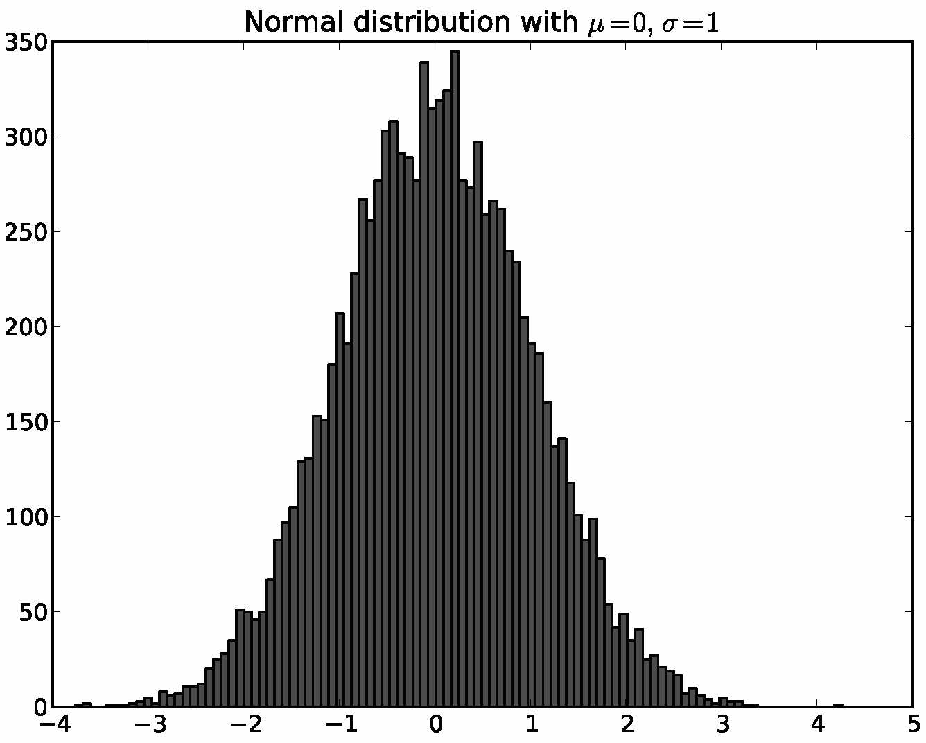
Below is a simple Python script illustrating the architecture above.
It defines the backend, connects a Figure to it, uses the array
library numpy to create 10,000 normally distributed random numbers,
and plots a histogram of these.
# Import the FigureCanvas from the backend of your choice
#  and attach the Figure artist to it.
from matplotlib.backends.backend_agg import FigureCanvasAgg as FigureCanvas
from matplotlib.figure import Figure
fig = Figure()
canvas = FigureCanvas(fig)

# Import the numpy library to generate the random numbers.
import numpy as np
x = np.random.randn(10000)

# Now use a figure method to create an Axes artist; the Axes artist is
#  added automatically to the figure container fig.axes.
# Here "111" is from the MATLAB convention: create a grid with 1 row and 1
#  column, and use the first cell in that grid for the location of the new
#  Axes.
ax = fig.add_subplot(111)

# Call the Axes method hist to generate the histogram; hist creates a
#  sequence of Rectangle artists for each histogram bar and adds them
#  to the Axes container.  Here "100" means create 100 bins.
ax.hist(x, 100)

# Decorate the figure with a title and save it.
ax.set_title('Normal distribution with $\mu=0, \sigma=1$')
fig.savefig('matplotlib_histogram.png')
The script using the API above works very well, especially for programmers,
and is usually the appropriate programming paradigm when writing a
web application server, a UI application, or perhaps a script to be
shared with other developers. For everyday purposes, particularly
for interactive exploratory work by bench scientists who are not
professional programmers, it is a bit syntactically heavy. Most
special-purpose languages for data analysis and visualization
provide a lighter scripting interface to simplify common tasks, and
matplotlib does so as well in its matplotlib.pyplot
interface. The same code above, using pyplot, reads
import matplotlib.pyplot as plt
import numpy as np

x = np.random.randn(10000)
plt.hist(x, 100)
plt.title(r'Normal distribution with $\mu=0, \sigma=1$')
plt.savefig('matplotlib_histogram.png')
plt.show()
pyplot is a stateful interface that handles much of the boilerplate
for creating figures and axes and connecting them to the backend of
your choice, and maintains module-level internal data structures
representing the current figure and axes to which to direct plotting
commands.
Let's dissect the important lines in the script to see how this internal state is managed.
import matplotlib.pyplot as plt: When the pyplot module
is loaded, it parses a local configuration file in which the user
states, among many other things, their preference for a default
backend. This might be a user interface backend like QtAgg,
in which case the script above will import the GUI framework and
launch a Qt window with the plot embedded, or it might be a pure
image backend like Agg, in which case the script will
generate the hard-copy output and exit.
plt.hist(x, 100): This is the first plotting command in
the script. pyplot will check its internal data structures to see
if there is a current Figure instance. If so, it will
extract the current Axes and direct plotting to the
Axes.hist API call. In this case there is none, so it will
create a Figure and Axes, set these as current, and
direct the plotting to Axes.hist.
plt.title(r'Normal distribution with $\mu=0, \sigma=1$'):
As above, pyplot will look to see if there is a
current Figure and Axes. Finding that there is, it
will not create new instances but will direct the call to the
existing Axes instance method Axes.set_title.
plt.show(): This will force the Figure to render,
and if the user has indicated a default GUI backend in their
configuration file, will start the GUI mainloop and raise any
figures created to the screen.
A somewhat stripped-down and simplified version of pyplot's
frequently used line plotting function matplotlib.pyplot.plot
is shown below to illustrate how a pyplot function wraps functionality
in matplotlib's object-oriented core. All other pyplot scripting
interface functions follow the same design.
@autogen_docstring(Axes.plot)
def plot(*args, **kwargs):
    ax = gca()

    ret = ax.plot(*args, **kwargs)
    draw_if_interactive()

    return ret
The Python decorator @autogen_docstring(Axes.plot) extracts
the documentation string from the corresponding API method and
attaches a properly formatted version to the pyplot.plot
method; we have a dedicated module matplotlib.docstring to
handle this docstring magic. The *args and **kwargs in
the documentation signature are special conventions in Python to mean
all the arguments and keyword arguments that are passed to the method.
This allows us to forward them on to the corresponding API method.
The call ax = gca() invokes the stateful machinery to "get
current Axes" (each Python interpreter can have only one "current
axes"), and will create the Figure and Axes if
necessary. The call to ret = ax.plot(*args, **kwargs) forwards
the function call and its arguments to the appropriate Axes
method, and stores the return value to be returned later. Thus the
pyplot interface is a fairly thin wrapper around the core
Artist API which tries to avoid as much code duplication as
possible by exposing the API function, call signature and docstring in
the scripting interface with a minimal amount of boilerplate code.
Over time, the drawing API of the output backends grew a large number of methods, including:
draw_arc, draw_image, draw_line_collection, draw_line, draw_lines, draw_point,
draw_quad_mesh, draw_polygon_collection, draw_polygon, draw_rectangle,
draw_regpoly_collection
Unfortunately, having more backend methods meant it took much longer to write a new backend, and as new features were added to the core, updating the existing backends took considerable work. Since each of the backends was implemented by a single developer who was expert in a particular output file format, it sometimes took a long time for a new feature to arrive in all of the backends, causing confusion for the user about which features were available where.
For matplotlib version 0.98, the backends were refactored to require only the minimum necessary functionality in the backends themselves, with everything else moved into the core. The number of required methods in the backend API was reduced considerably, to only:
draw_path: Draws compound polygons, made up of line and
Béezier segments. This interfaces replaces many of the old
methods: draw_arc, draw_line, draw_lines,
and draw_rectangle.
draw_image: Draws raster images.
draw_text: Draws text with the given font properties.
get_text_width_height_descent: Given a string of
text, return its metrics.
It's possible to implement all of the drawing necessary for a new
backend using only these methods. (We could also go one step
further and draw text using draw_path, removing the
need for the draw_text method, but we haven't gotten
around to making that simplification. Of course, a backend would
still be free to implement its own draw_text method to
output "real" text.) This is useful for getting a new backend
up and running more easily. However, in some cases, a backend may
want to override the behavior of the core in order to create more
efficient output. For example, when drawing markers (small symbols
used to indicate the vertices in a line plot), it is more
space-efficient to write the marker's shape only once to the file, and
then repeat it as a "stamp" everywhere it is used. In that case,
the backend can implement a draw_markers method. If it's
implemented, the backend writes out the marker shape once and then
writes out a much shorter command to reuse it in a number of
locations. If it's not implemented, the core simply draws the marker
multiple times using multiple calls to draw_path.
The full list of optional backend API methods is:
draw_markers: Draws a set of markers.
draw_path_collection: Draws a collection of paths.
draw_quad_mesh: Draws a quadrilateral mesh.
matplotlib spends a lot of time transforming coordinates from one system to another. These coordinate systems include:
Every Artist has a transformation node that knows how to
transform from one coordinate system to another. These transformation
nodes are connected together in a directed graph, where each node is
dependent on its parent. By following the edges to the root of the
graph, coordinates in data space can be transformed all the way to
coordinates in the final output file. Most transformations are
invertible, as well. This makes it possible to click on an element of
the plot and return its coordinate in data space. The transform graph
sets up dependencies between transformation nodes: when a parent
node's transformation changes, such as when an Axes's limits are
changed, any transformations related to that Axes are invalidated
since they will need to be redrawn. Transformations related to other
Axes in the figure, of course, may be left alone, preventing
unnecessary recomputations and contributing to better interactive
performance.
Transform nodes may be either simple affine transformations and non-affine transformations. Affine transformations are the family of transformations that preserve straight lines and ratios of distances, including rotation, translation, scale and skew. Two-dimensional affine transformations are represented using a 3×3 affine transformation matrix. The transformed point (x', y') is obtained by matrix-multiplying the original point (x, y) by this matrix:
Two-dimensional coordinates can then easily be transformed by simply multiplying them by the transformation matrix. Affine transformations also have the useful property that they can be composed together using matrix multiplication. This means that to perform a series of affine transformations, the transformation matrices can first be multiplied together only once, and the resulting matrix can be used to transform coordinates. matplotlib's transformation framework automatically composes (freezes) affine transformation matrices together before transforming coordinates to reduce the amount of computation. Having fast affine transformations is important, because it makes interactive panning and zooming in a GUI window more efficient.
Non-affine transformations in matplotlib are defined using Python functions, so they are truly arbitrary. Within the matplotlib core, non-affine transformations are used for logarithmic scaling, polar plots and geographical projections (Figure 11.5). These non-affine transformations can be freely mixed with affine ones in the transformation graph. matplotlib will automatically simplify the affine portion and only fall back to the arbitrary functions for the non-affine portion.
From these simple pieces, matplotlib can do some pretty advanced things. A blended transformation is a special transformation node that uses one transformation for the x axis and another for the y axis. This is of course only possible if the given transformations are "separable", meaning the x and y coordinates are independent, but the transformations themselves may be either affine or non-affine. This is used, for example, to plot logarithmic plots where either or both of the x and y axes may have a logarithmic scale. Having a blended transformation node allow the available scales to be combined in arbitrary ways. Another thing the transform graph allows is the sharing of axes. It is possible to "link" the limits of one plot to another and ensure that when one is panned or zoomed, the other is updated to match. In this case, the same transform node is simply shared between two axes, which may even be on two different figures. Figure 11.6 shows an example transformation graph with some of these advanced features at work. axes1 has a logarithmic x axis; axes1 and axes2 share the same y axis.
When plotting line plots, there are a number of steps that are performed to get from the raw data to the line drawn on screen. In an earlier version of matplotlib, all of these steps were tangled together. They have since been refactored so they are discrete steps in a "path conversion" pipeline. This allows each backend to choose which parts of the pipeline to perform, since some are only useful in certain contexts.
NaN, or using numpy masked arrays.
Vector output formats, such as PDF, and rendering libraries, such as
Agg, do not often have a concept of missing data when plotting a
polyline, so this step of the pipeline must skip over the missing
data segments using MOVETO commands, which tell the renderer
to pick up the pen and begin drawing again at a new point.
Since the users of matplotlib are often scientists, it is useful to put richly formatted math expressions directly on the plot. Perhaps the most widely used syntax for math expressions is from Donald Knuth's TeX typesetting system. It's a way to turn input in a plain-text language like this:
\sqrt{\frac{\delta x}{\delta y}}
into a properly formatted math expression.
matplotlib provides two ways to render math expressions. The first,
usetex, uses a full copy of TeX on the user's machine to render the
math expression. TeX outputs the location of the characters and
lines in the expression in its native DVI (device independent) format.
matplotlib then parses the DVI file and converts it to a set of
drawing commands that one of its output backends then renders directly
onto the plot. This approach handles a great deal of obscure math
syntax. However, it requires that the user have a full and working
installation of TeX. Therefore, matplotlib also includes its own
internal math rendering engine, called mathtext.
mathtext is a direct port of the TeX math-rendering engine, glued
onto a much simpler parser written using the pyparsing
[McG07] parsing framework. This port was written based
on the published copy of the TeX source code [Knu86].
The simple parser builds up a tree of boxes and glue (in TeX
nomenclature), that are then laid out by the layout engine. While the
complete TeX math rendering engine is included, the large set of
third-party TeX and LaTeX math libraries is not. Features in such
libraries are ported on an as-needed basis, with an emphasis on
frequently used and non-discipline-specific features first. This
makes for a nice, lightweight way to render most math expressions.
Historically, matplotlib has not had a large number of low-level unit tests. Occasionally, if a serious bug was reported, a script to reproduce it would be added to a directory of such files in the source tree. The lack of automated tests created all of the usual problems, most importantly regressions in features that previously worked. (We probably don't need to sell you on the idea that automated testing is a good thing.) Of course, with so much code and so many configuration options and interchangeable pieces (e.g., the backends), it is arguable that low-level unit tests alone would ever be enough; instead we've followed the belief that it is most cost-effective to test all of the pieces working together in concert.
To this end, as a first effort, a script was written that generated a number of plots exercising various features of matplotlib, particularly those that were hard to get right. This made it a little easier to detect when a new change caused inadvertent breakage, but the correctness of the images still needed to be verified by hand. Since this required a lot of manual effort, it wasn't done very often.
As a second pass, this general approach was automated. The current matplotlib testing script generates a number of plots, but instead of requiring manual intervention, those plots are automatically compared to baseline images. All of the tests are run inside of the nose testing framework, which makes it very easy to generate a report of which tests failed.
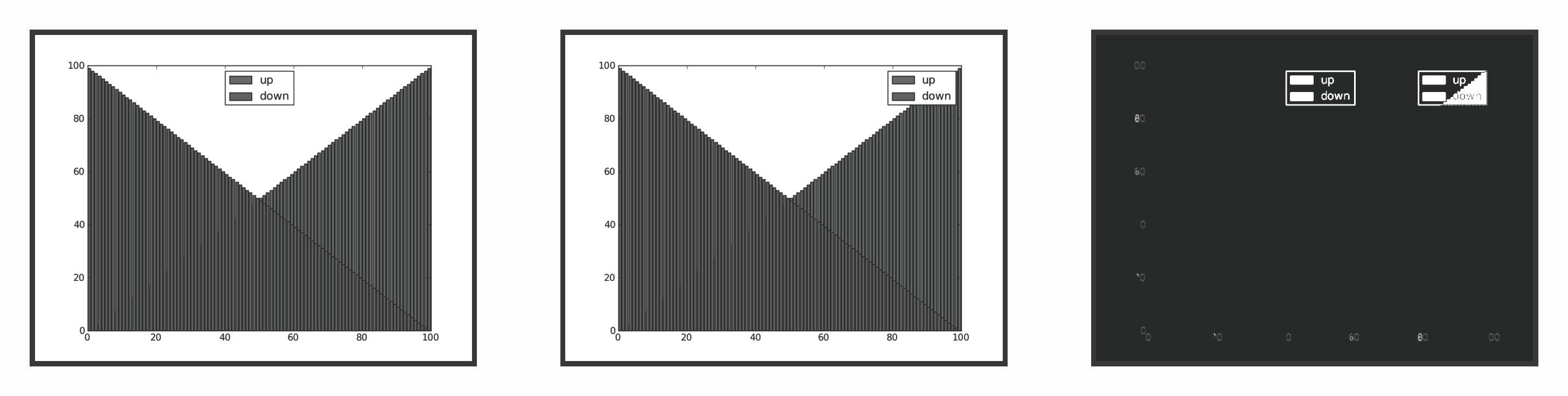
Complicating matters is that the image comparison cannot be exact. Subtle changes in versions of the Freetype font-rendering library can make the output of text slightly different across different machines. These differences are not enough to be considered "wrong", but are enough to throw off any exact bit-for-bit comparison. Instead, the testing framework computes the histogram of both images, and calculates the root-mean-square of their difference. If that difference is greater than a given threshold, the images are considered too different and the comparison test fails. When tests fail, difference images are generated which show where on the plot a change has occurred (see Figure 11.9). The developer can then decide whether the failure is due to an intentional change and update the baseline image to match the new image, or decide the image is in fact incorrect and track down and fix the bug that caused the change.
Since different backends can contribute different bugs, the testing framework tests multiple backends for each plot: PNG, PDF and SVG. For the vector formats, we don't compare the vector information directly, since there are multiple ways to represent something that has the same end result when rasterized. The vector backends should be free to change the specifics of their output to increase efficiency without causing all of the tests to fail. Therefore, for vector backends, the testing framework first renders the file to a raster using an external tool (Ghostscript for PDF and Inkscape for SVG) and then uses those rasters for comparison.
Using this approach, we were able to bootstrap a reasonably effective testing framework from scratch more easily than if we had gone on to write many low-level unit tests. Still, it is not perfect; the code coverage of the tests is not very complete, and it takes a long time to run all of the tests. (Around 15 minutes on a 2.33 GHz Intel Core 2 E6550.) Therefore, some regressions do still fall through the cracks, but overall the quality of the releases has improved considerably since the testing framework was implemented.
One of the important lessons from the development of matplotlib is, as Le Corbusier said, "Good architects borrow". The early authors of matplotlib were largely scientists, self-taught programmers trying to get their work done, not formally trained computer scientists. Thus we did not get the internal design right on the first try. The decision to implement a user-facing scripting layer largely compatible with the MATLAB API benefited the project in three significant ways: it provided a time-tested interface to create and customize graphics, it made for an easy transition to matplotlib from the large base of MATLAB users, and—most importantly for us in the context of matplotlib architecture—it freed developers to refactor the internal object-oriented API several times with minimal impact to most users because the scripting interface was unchanged. While we have had API users (as opposed to scripting users) from the outset, most of them are power users or developers able to adapt to API changes. The scripting users, on the other hand, can write code once and pretty much assume it is stable for all subsequent releases.
For the internal drawing API, while we did borrow from GDK, we did not spend enough effort determining whether this was the right drawing API, and had to expend considerable effort subsequently after many backends were written around this API to extend the functionality around a simpler and more flexible drawing API. We would have been well-served by adopting the PDF drawing specification [Ent11b], which itself was developed from decades of experience Adobe had with its PostScript specification; it would have given us mostly out-of-the-box compatibility with PDF itself, the Quartz Core Graphics framework, and the Enthought Enable Kiva drawing kit [Ent11a].
One of the curses of Python is that it is such an easy and expressive language that developers often find it easier to re-invent and re-implement functionality that exists in other packages than work to integrate code from other packages. matplotlib could have benefited in early development from expending more effort on integration with existing modules and APIs such as Enthought's Kiva and Enable toolkits which solve many similar problems, rather than reinventing functionality. Integration with existing functionality is, however, a double edge sword, as it can make builds and releases more complex and reduce flexibility in internal development.